Still going to use the same data but look at some of the other options to visualise these relationship. Tools like Gephi offer many ways to layout the plots
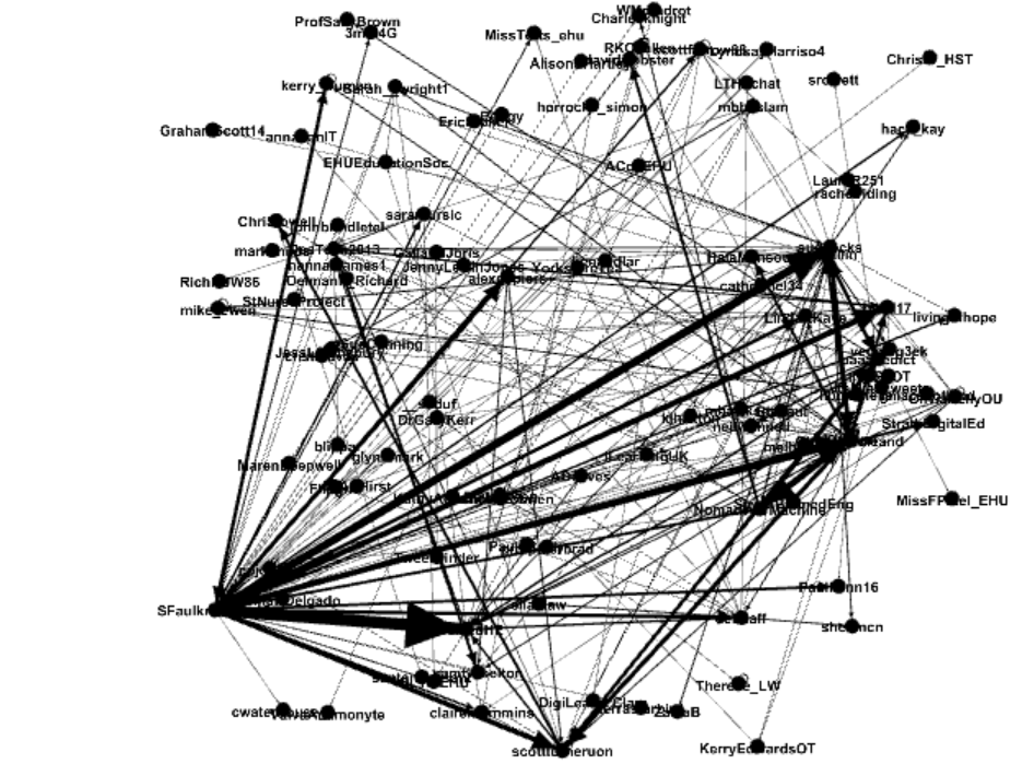
The one below is the ForceAtlas2 layout is good for showing groupings for this problem:


One of the features of Gephi is you can add plug-ins; including new layouts. Two I am enjoying playing with is the Circular layout

Also the Dual circular layout - where you set two circles based on some criterian in this case number of interactions - the outer ring has the 20 highest scoring nodes and the central ring is the remaining nodes.

Take home item I think is just play with the layouts and the tools.
All views and opinions are the author's and do not necessarily reflected those of any organisation they are associated with. Twitter: @scottturneruon
No comments:
Post a Comment