Tuesday 28 August 2018

Web VR with the Oculus DK1

A recent BSc Games Development project by Jack Taylor look at the use of older VR equipment options running on newer operating system, specifically Windows 10. Aim of this work was a lower cost system, for users, including educational use. In the second post below Jack discusses his work.


Web VR with the Oculus DK1
Jack Taylor

In my previous blog post, I covered the usage of older VR technology within development environments. This demonstrated the installation of the Oculus DK1 on Windows 10, as well as the it’s use with Unity 2017. As a follow up, this blog post will extend the uses of the Oculus DK1 within a Web VR development environment using AFrame and HTML. If you have not read the first blog post, please do so to follow the instructions on how to install and use your old Oculus headset on Windows 10. You can find that here: https://computingnorthampton.blogspot.com/2018/05/vr-on-cheap.html

PLEASE NOTE: When creating this project, I had to use Mozilla Firefox as other browsers lack support for certain platforms when using WebVR.
You will also need to have SteamVR running when testing WebVR scenes, else this will not work! If you have not yet read my other blog post, please do so to ensure that you have covered the installation of your Oculus DK1 headset!

Setting up your AFrame environment.


To start your development, you will first need an IDE. Any IDE is suitable for this process. I would recommend Sublime Text or Notepad++. Please ensure that your VR device is connected to your machine before starting this process.
To begin, you will first need to create an index file for your WebVR project. I recommend starting a nice empty folder, so you have a clean work environment. When creating the file, please make sure that you save it as a HTML file before you continue.
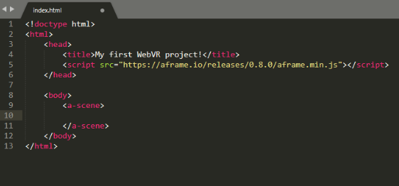
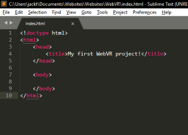
When you’ve created the file, you will need to start with a layout like mine. However, feel free to customise it as you wish.


Once you have saved the file and filled it with the contents as shown above, you will be able to start developing a web page!
Now, for WebVR to work as we would like it to, we need to import some global scripts which are provided by AFrame within the head tags of your file. You can find the script on the AFrame documentation here: https://aframe.io/docs/0.8.0/introduction/. Once you have inserted this script, your web page will support the AFrame API, which you can use to create your scenes.
To create a scene for your web page, you will need to add a couple of tags to between your and tags. The tags you will need to insert will create a scene for you, so you can start putting objects in to your scene. These tags are and .
Once completed, your file should look like this:


Now we have our scene set up, let’s start adding some surroundings to our scene.
For this example, I will be using some assets provided by my University. If you would like to explore the models available for AFrame scenes, you can view them on the AFrame documents here: https://aframe.io/docs/0.8.0/introduction/html-and-primitives.html.
Luckily with AFrame, you can specify different styles and sizes for the objects you add to your scene. For this example, I will be using , , , and elements. I will continue to post images of my example as we progress, so you can use them as a reference when creating a project, should you wish to do so.
Before I demonstrate the implementation of assets within our scene, I would recommend running your new file in a browser to make sure that everything is working as intended.
Your scene will be blank, and will look like this:


Notice the headset icon in the bottom right of your scene. That will trigger your VR headset and set your browser to run in Full Screen.
Okay, let’s start populating our scene by adding a few elements. First, we will start with a Sky which will brighten up our project a bit. For this example, here is the code I will be using:
Feel free to change the colour around to suit your project needs. Once added, save and run your file again to view your changes. You can do this as many times as you like.
Once saved, your project will look like this:


You can continue to add more elements to your scene as you would like. AFrame allows you to specify different properties for your objects, such as the position, colour, size, and many more.
Let’s add a few elements to this scene to populate it a bit.
Here is the code for the elements you should add next as part of this example:


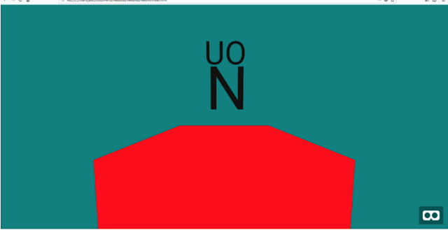
value="UO" color="#111" position="0 1.8 -0.5"  align="center" width="2.6">


As you can see, the four new lines above have new properties, which will contribute to the way these objects behave in your scene. A full list of the API properties can be found on the documentation (https://aframe.io/docs/0.8.0/components/background.html). Save your file and run it within your browser.
Your scene should now look like this:
Feel free to try this out using your Virtual Reality headset.

-->
That just about covers the basics of using WebVR with your Oculus DK1 headset. I hope this article was helpful! Please feel free to suggest any changes to this post if you think that something is missing. Enjoy your experiments!

All views and opinions are the author's and do not necessarily reflected those of any organisation they are associated with. Twitter: @scottturneruon

Thursday 23 August 2018

Visualising the Research 1: Visualising the authors

I love seeing data displayed visually; like a lot of people handling data one of the first thoughts that goes through my head is how can I 'look' at this. Recently, I have become interested in how particular groups of researcher worked together 
- can this be the visualised?
- how does the group work? Or rather can we get a sense of how the group works?
- Is there some insights that we can draw about the group from more quantitative approaches - if you like (and I do) social network analysis based on publications.

The particular group is a group of computing researchers based at the University of Northampton. The data comes from the University's repository - NECTAR. It is not expected that the process will reveal a highly nuanced analysis, lots of personal aspects important in research collaboration won't be picked up; but the goal is just to have a starting point.


Collecting the Data.
This is the easiest part, in this case, because the data comes from the repository we just need it in a form suited to the tools that follow. A two-stage process was followed
- Go to http://nectar.northampton.ac.uk/view/divisions/SSTCT.html the page linking to all the papers in the repository categorised as from the computing team;
- From there export the list into Reference Manager/.RIS format the tool for the next stage can take information in that format.


Starting the visualisation: coauthors
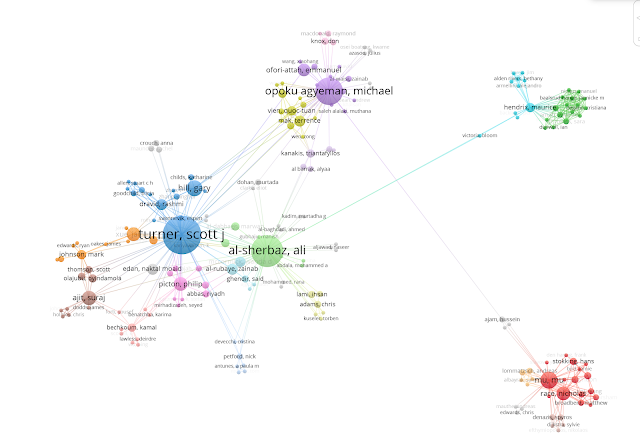
My tool of choice is VosViewer (http://www.vosviewer.com/). Once the software is running, find the create button and then load your .RIS file from the previous stage, I select to not include all groups just to visualise the main group (13 records were excluded). Some of the other settings including authors even if they were a co-author on one paper.
In this example we get the following:
Connections appear as straight lines and the maximum possible lines was set to show all the lines. It seems to show 'hubs' the larger the circle the more documents they have in the repository. The last thing I am going to do is save the network as a Pajek network file using the save button on the lefthand menu and select the option.


Putting some numbers to it!
Love the visuals but now I want to quantify the node (the authors) role in the network of co-authors. All of that is really saying can we get some new insights from looking at the network, as a social networking analysis task. My favourite tool for this is the widely used free and open-source Gephi (https://gephi.org/). 

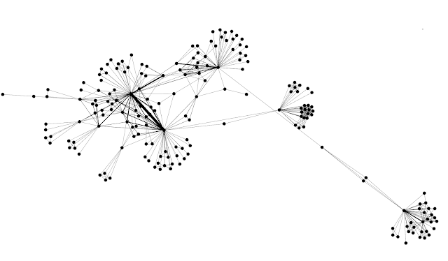
Load in the Pajek formatted file saved in the last stage (it should have a .net extension). Once the file is loaded (in the options make sure is set to be an undirected graph), it usually puts the viewer into the Data Laboratory view, change the view to Overview. The graph may now appear as a single circle on the screen, now the fun can begin. Down the lefthand side of the screen there is a Tab marked Layout which brings-up a dropdown menu of different layouts have a play, select one and press run and see what they do.

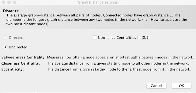
Down the right side of the screen there a number of options. What we are going to focus on here, as an example, is the Edge Overview and the one option there Average Path Length; find the option and press run a screen will come up saying the three measures (see above) we will get, press ok, and then change the view to Data Laboratory. Below are some initial insights for these measures

  • Betweenness Centrality- sorting based on the one showed the 'hubs' that were presented in the first figure score highly. One aspect I wasn't expecting was two MSc Computing student who have published scored quite highly due to the papers they published linking authors who haven't collaborated previously
  • Closeness Centrality: Again the 'hubs' scored highly but also so did one of the MSc students.
  • Eccentricity: A low eccentricity score was seen for the hubs in general.


The insight I have found most interesting is the idea that MSc students publishing might have a positive knock-on effect on connecting staff researchers.


All views and opinions are the author's and do not necessarily reflected those of any organisation they are associated with. Twitter: @scottturneruon
Wednesday 22 August 2018

Computing for Social Good 6: Games Team bring history to life at Chester Farm


In a recent article in the Guardian "Can a University rescue a city the local authority fails?" the role of Universities and specifically The University of Northampton in providing social good was discussed. This is part of a series highlighting some of the areas that the computing team are helping, including:

  1. Blockchain and Education
  2. The Big Bang (Northamptonshire)
  3. Games in Education
  4. Inspiring into coding


Taken from the original "Computing experts bring history to life at Chester Farm" https://www.northampton.ac.uk/news/computing-experts-bring-history-to-life-at-chester-farm/ 

A site of significant historical importance that’s hidden from view is being brought to life by an expert team from the University of Northampton.
Chester Farm is the site of a walled Roman town which lies buried beneath fields between the Northamptonshire towns of Wellingborough and Rushden. The land also contains evidence from the Mesolithic, Iron Age and Medieval periods, together with a complex of traditional farm buildings dating back to the 17th century.
While archaeological excavation of the site is slowly revealing the site’s secrets, academics from the University’s computing team have been creating 3D interactive models to help visitors picture how it might have looked.
Games Art Lecturer, Daniel McCaul, has created an Iron Age roundhouse; Graduate Teaching Assistant, Lewis Sanderson, a Saxon building; and Games Art Senior Lecturer, Iain Douglas, an example of a 19th century ironstone quarrying cart.
Iain said: “This was a really fun project for our team and with the growing catalogue of historical projects that we have recreated and put in VR, it’s an area we’re very keen on investing further time into.
“We are also exploring the possibility of providing a larger virtual experience in Chester Farm’s new visitor centre, or perhaps for other historic attractions in the country.”


All views and opinions are the author's and do not necessarily reflected those of any organisation they are associated with. Twitter: @scottturneruon